Improving Booking Flow UX
June 25, 2026 · 10 min read
Improving Booking Flow UX
Most booking drop-off comes from three things: unclear pricing, long forms, and low trust at checkout. If I fix those first - then clean up mobile pain points - I can cut support questions and get more people from product page to paid booking.
Here’s the short version:
- Show the full price early: rate, deposit, taxes, fees, and add-ons
- Make rules easy to see: pickup time, cancellation, ID needs, and rental minimums using automated identity verification
- Trim the form: ask only for what’s needed to book
- Keep checkout mobile-friendly: large tap targets, simple date pickers, sticky Book Now button
- Add trust near payment: security badges, cancellation summary, and clear next steps
- Send confirmation fast: email or text within 60 seconds with pickup details and booking status
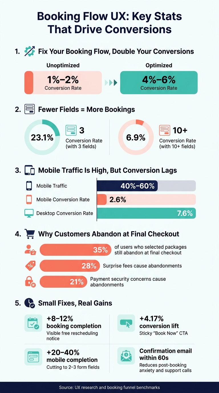
A few numbers make the case. Unoptimized funnels often convert at 1% to 2%, while better booking flows can hit 4% to 6%. Forms with 3 fields average 23.1% conversion, but forms with 10+ fields drop to 6.9%. And mobile traffic can make up 40% to 60% of visits, yet mobile conversion still trails desktop.
If I had to fix the flow in order, I’d do this:
- Price clarity
- Form length and date picker issues
- Checkout trust signals
- Mobile layout and speed
- Confirmation and [self-serve status checking](https://www.lockii.app/post/self-service-rentals-common-questions-answered)
Bottom line: if people have to guess the cost, fight the form, or wonder what happens after they pay, many of them leave.
Unclear pricing and booking rules create hesitation
When someone is ready to book, the last thing they should feel is doubt. Hidden fees, vague deposits, and fuzzy pickup details make people stop. And that small pause? That’s often where the booking falls apart.
Show the full cost before checkout
Customers should see the full price before they ever get to the payment screen. That means the daily rate, refundable deposit, taxes, fees, and any add-ons.
A clear breakdown can be as simple as:
- $49.00/day
- $150.00 refundable deposit
- taxes listed on a separate line
No guessing. No mental math.
Extra charges that appear at payment are a common reason people leave. As Ryan Keen of HQRent puts it:
"A renter who sees the deposit on the listing page or at the start of checkout has already incorporated it into their decision. A renter who sees it at the payment step has to re-decide." [2]
A sticky price summary that updates when dates change helps cut that last-minute second-guessing.
Once the price is clear, people want to know one thing next: how the booking actually works.
Make availability and booking terms easy to scan
Pickup windows, minimum rental periods, cancellation rules, and extension policies should be easy to spot. Not tucked away in Terms.
A line like _"Free cancellation up to 24 hours before your booking"_ next to the booking button does far more than a buried note. Research shows that adding a visible "free rescheduling" notice can increase booking completion by 8–12%. [5]
For contactless rentals, the process should be just as plain as the price. Show the pickup location and explain how access works right away. A line such as _"Contactless pickup via keypad code provided at 3:00 PM"_ on the listing page answers the question before it turns into a reason to leave.
Comparison table: unclear vs. clear booking information
| What Customers See | High-Friction Version | Low-Friction Version | | --- | --- | --- | | Deposit | Revealed only at the payment step | "$150.00 refundable deposit" shown on the listing page | | Total cost | "Taxes and fees calculated at checkout" | Full itemized total shown from step one | | Pickup/return time | "Pickup at our location" | Pickup: Aug. 15, 2026, 3:00 PM - Return: Aug. 16, 2026, 3:00 PM | | Cancellation policy | Link to Terms and Conditions | "Free cancellation up to 24 hours before your booking" | | ID requirements | "Requirements explained only after checkout" | "Valid U.S. driver's license required; have it ready before booking." |
The pattern is pretty clear. Items in the high-friction column force customers to guess or hunt for answers. The low-friction version does the opposite: it tells people what they need to know right away, so they can keep moving.
sbb-itb-eb44693
Too many steps and form fields cause drop-off
Once pricing is clear, the form should ask for only the details needed to lock in the rental. The moment a booking flow gets long, repeats questions, or pushes people to make an account first, drop-off climbs. The numbers make that pretty plain: forms with 3 fields average a 23.1% conversion rate, while forms with 10 or more fields fall to 6.9% [4]. After you trim the form, the next hurdle is simple: will people trust the last step enough to pay?
Cut form fields down to what is needed to confirm the booking
A booking form should stick to the basics needed to confirm the reservation:
- Name
- Pickup and return dates
- Payment details
Anything beyond that - like emergency contacts, preferences, or extra notes - can wait until after the booking is confirmed [3][4].
Forced account creation is another common reason people bail. Let customers check out as guests first. Then, after the reservation is confirmed, offer them the option to create an account [3][6].
Small field choices matter too. A single "Full Name" field can work better than splitting the name into first and last name boxes. It also helps to use the right input type for each field, like tel for phone numbers and numeric for quantity. On mobile, that can make typing faster and cut down on mistakes [3][4].
Fix date, time, and error handling
A clunky date picker can wipe out all that progress. Calendars should show weekday names, gray out unavailable slots, and use U.S. date formatting, such as 09/03/2026, instead of unclear numeric strings. Time slots should also be shown in a clear 12-hour AM/PM format, like 10:30 AM, not 24-hour time [3].
Error handling matters just as much. Vague messages slow people down. Clear guidance like "Enter a valid 10-digit U.S. phone number" tells the user what to fix right away. And if the form throws an error, it should never wipe out fields that were already filled in. Inline validation can flag problems as someone types, which cuts friction and keeps the process moving [1][3].
When the form works smoothly and doesn't make people fight the interface, trust at checkout becomes the last hurdle.
Weak trust signals hurt completion at the final step
Even when the form is clean, one last obstacle can still derail the booking: trust at payment. 35% of users who already picked packages and dates still abandon at the final checkout step [7]. The biggest reasons are surprise fees, weak security signals, and not knowing what happens after payment.
Reassure users before they pay
At checkout, two issues do most of the damage: surprise fees and weak security cues. Unexpected fees cause 28% of abandonments, and payment security concerns account for another 21% [7]. If there's a deposit, fee, or ID check, show it _before_ the payment step.
Place PCI compliance badges and a Secure Checkout label right next to the credit card fields. Add a one-line cancellation summary near the Pay Now button instead of tucking it behind a link.
Show ID requirements early too. If someone finds out halfway through checkout that they need to upload a driver's license, that alone can be enough to kill the booking [2].
Give customers confidence after they book
Trust doesn't stop once payment goes through. It carries into the confirmation. That message is part of the booking flow, not some side detail. Send the confirmation email within 60 seconds to reduce post-booking anxiety and cut support calls [7].
The confirmation should include:
- The booking reference number
- The pickup address
- What to bring
- The next step, such as: "You'll receive your access code 2 hours before pickup."
For contactless rentals, that last detail matters a lot. It helps stop the second wave of doubt that can hit after booking but before pickup.
A Find My Order page also gives customers a simple way to check status without reaching out to support.
Where Lockii can reduce booking friction
Tools that keep checkout on-site and send confirmations right away can smooth out this last step. Lockii supports embeddable booking widgets, identity verification, instant SMS and email confirmations, a self-service portal, and a Find My Order page to reduce last-step drop-off. That shrinks the gap between payment and confirmation and helps cut abandonment at the finish line.
Mobile booking UX and what to fix first
After pricing, forms, and trust are fixed, mobile layout often becomes the next big conversion blocker. Mobile users run into the same friction as desktop users, but they have less patience and a lot less room to work with on screen. Between 40% and 60% of all booking traffic now comes from mobile devices [5], yet mobile conversion rates average just 2.6% compared to 7.6% on desktop [8].
Fix the mobile issues that block completion
The fastest wins usually come from fixing the basics. Every button and form field should be at least 44x44 pixels [5]. On mobile, the page should follow one simple order: listing details, description, calendar, then form [5]. That way, people don’t have to hunt around or jump back and forth.
Keep the "Book Now" button visible while users scroll. A sticky CTA has been shown to increase conversions by 4.17% [1]. It sounds small, but on a booking page, small lifts add up fast.
Use native mobile inputs wherever you can. For example, trigger the numeric keyboard for phone numbers. Keep checkout to the fewest fields possible too. Cutting the form down to 2–3 fields can increase completion rates by 20% to 40% [5]. On mobile, every extra field feels heavier than it does on desktop.
Speed matters just as much. Pages that take longer than 4 seconds lose 25% of visitors before they load [5]. That’s a brutal drop, especially when someone is already close to booking.
Prioritize changes by drop-off and customer complaints
Once you can see the mobile flow in your data, start with the step where people stop most often. Segment analytics by device type and compare where mobile users exit versus desktop users [1][3]. That’s usually where the pain shows up first.
Then check session recordings. Look for rage clicks, extra scrolling, and repeated taps on unavailable dates [1]. Those moments tell you where users think something should work, but it doesn’t.
Support tickets help too. If people keep asking _"Is my booking confirmed?"_ or _"What's the deposit?"_, the flow isn’t showing that information clearly enough [3]. When the same questions keep showing up, that’s not a support problem. It’s a UX problem.
| Identification Method | What to Look For | Tool/Source | | --- | --- | --- | | Analytics | High drop-off at specific steps; mobile vs. desktop conversion gaps | Google Analytics / Funnel Reports | | Session Replays | Rage clicks; excessive scrolling; repeated clicks on unavailable dates | FullStory / Hotjar | | Support Tickets | Questions about "Is my booking confirmed?"; confusion over deposits | Help Desk / CRM | | User Testing | Difficulty tapping buttons; slow loading on cellular networks | Real Mobile Device |
Fix the highest-drop-off step first. After that, move to the next biggest leak in the booking flow.